Wednesday, February 24, 2010

Saturday, September 19, 2009
Amateur Filmmakers Club Logo 2:47 PM

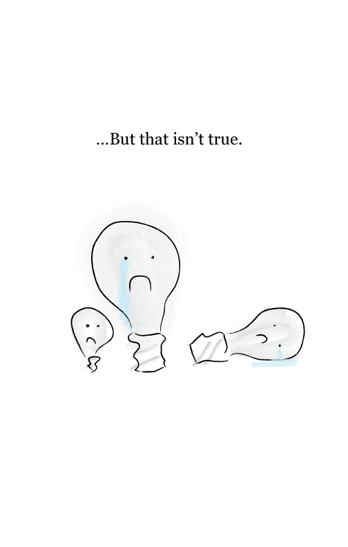
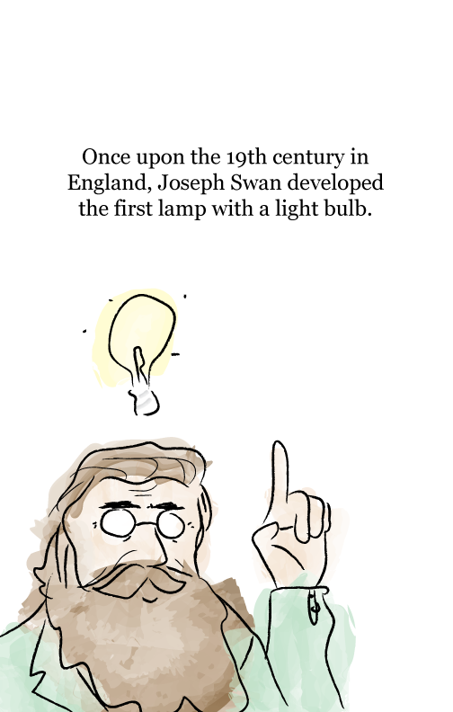
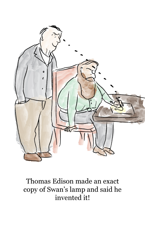
US History Children's Book Illustrations 1:58 PM

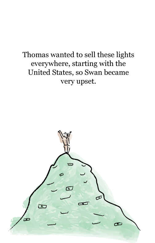
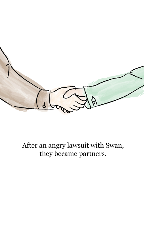
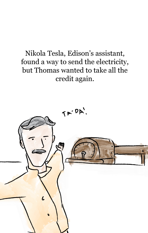
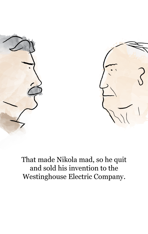
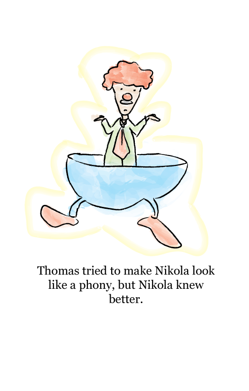
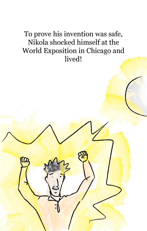
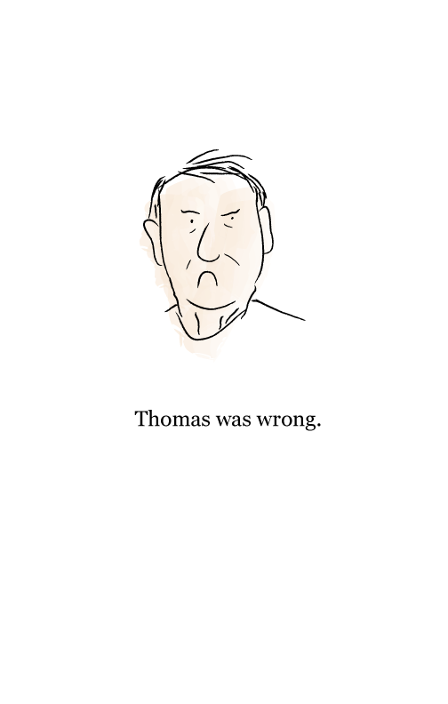
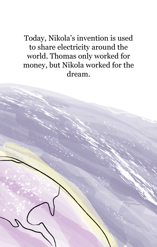
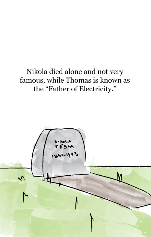
Hey guys! This is a set of illustrations made for my group's children's book project for Mr. Denman. I used a mouse for everything (ima get a wacom soon) and watercolor brushes in illustrator. Props to Quentin Blake, illustrator of Rald Dahl books and the artist from whom I drew inspiration. nice Enjoy the book!




Saturday, August 1, 2009
Web Design #2 9:16 PM
 Client wanted a very minimalist layout without images. That meant the design had to be 100% typography.
So to layout everything I used a 16 column grid. Grids are very helpful and used by a lot of big name designers (Wim Crowell, Josef Muller-Brockmann). I didn't use rows though, so flow of text is uneven vertically sometimes, fail :\. But other than that you'll see that everything is aligned.
Umm I used big type, especially in the main article for the sake of readability. Web designers like to use super small fonts because they think cluttered is good or because they're following the trend that was set when screens were super small. I also used #333 instead of black, so that it's easier on the eyes when reading on the white background. APPRECIATE.
The markup is not w3 valid(sorry, Jason!). It still works... but the layout falls apart in IE6. I'll probably rewrite it and release it as a free wordpress theme. Which reminds me, I wanna make tumblr themes. Here's the link:
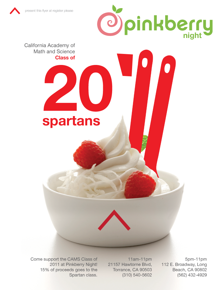
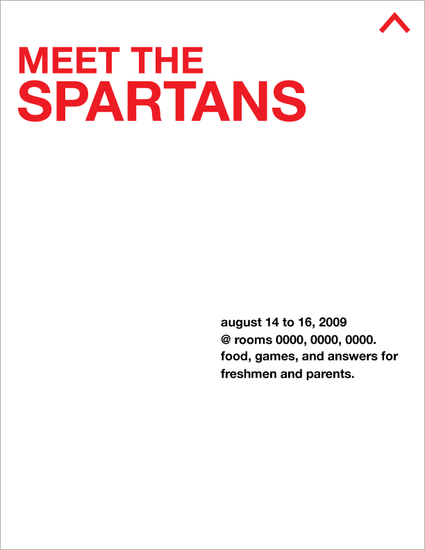
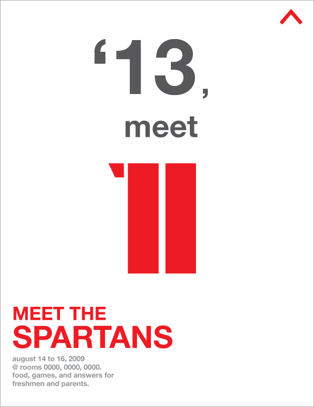
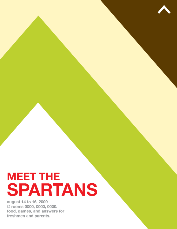
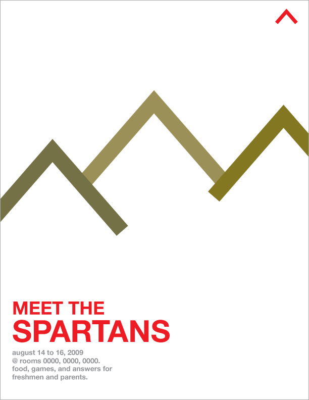
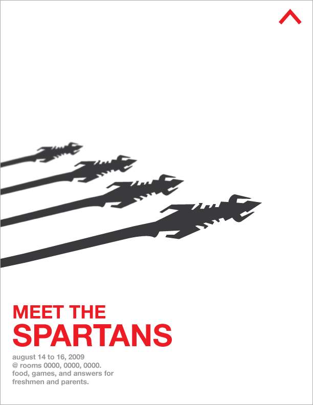
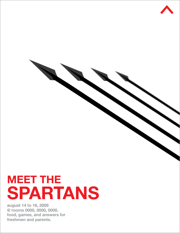
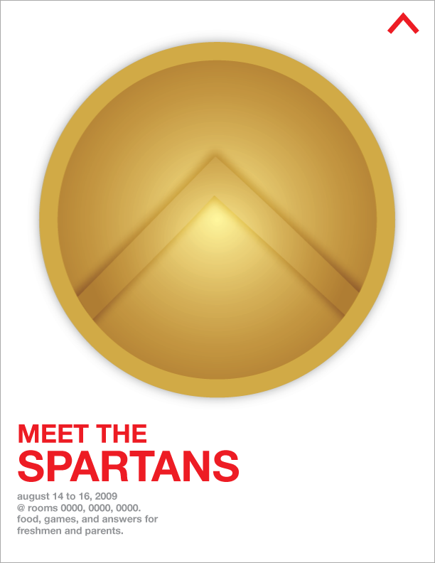
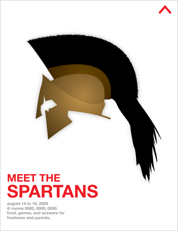
Print Design #1! Meet the Spartans 8:30 PM
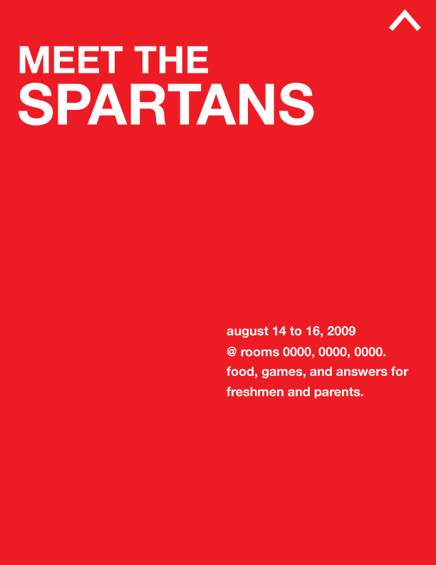
mmkay, I made a lot of flyers because I wanted to. these are still drafts—the room numbers are still 0000. does anyone know brown, nishiyama, and paus's room numbers?thankX.
It's set in helvetica... I like Helvetica. I don't care about the typeface being used everywhere (watch Helvetica, a documentary by Gary Hustwit), and I agree with Massimo Vignelli (pretentious reference to designer) that type should not be expressive... to a certain extent. There are situations that are perfect for certain typefaces or vice versa. Type can be expressive in a design, if it's done really well.
And I really don't like it when people think that typography is picking a font. This leads to grunge fonts on a picture of smiling children. I think charisse or demitri did this. not attacking you guys, don't worry.
So I picked Helvetica, a really neutral typeface. I didn't use a serif font because... iono I want to have a modern image for our class? sure spartans are ancient... but we're kids and it's 2009, so modernism ftw.
So yeah, I designed these to hopefully catch the eye. These will be printed on letter size paper, so they're pretty small. Big designs in the middle attract attention, and then the event info gets noticed. I made all of the graphics in illustrator.
/incoherent

Monday, July 20, 2009
Corporate Identity Design #1: Beach Cities Orthopedics [UPDATE] 10:51 PM
I was afraid that they'd reject my original, so I made another one that more sportsy (Beach Cities Orthopedics and Sports Medicine). I made the helmet and everything myself (big whoop, right? just want to point out that it's not premade stock art).

Saturday, July 18, 2009
Corporate Identity Design #1: Beach Cities Orthopedics 1:35 AM
My sister came home from work wearing the new Beach Cities Ortho caps. She hates the logo, which was made by her boss's girlfriend. My sister referred me to design the logo. So this is their current logo (on cap):

Their current logo consists of a barely distinguishable football player silhouette, huge weight BCO (with an ugly C), and an unprofessional typeface below. Problems with this logo:
- the football player is kinda hard to make out
- the football player won't scale well (e.g. small logo on stationary)
- the typeface suggests an unreliable/unprofessional company. neutral and human typefaces are good for corporate identity (helvetica)
- it's pretty ugly.
- how do you relate "beach cities" to a football player? I mean they special in sports medicine too... but it just isn't fit for a logo
- No color. Color scheme strengthens identity (Target, Coke, McDonalds).
So... I set out to resolve these problems and create a scalable, colorful, professional, related, and beautiful logo. I looked at the roundness of the B, C, and O and tried to use it to my advantage. I also tried hard to incorporate something beach themed into the design. Enough about the process—here's my best shot:

See there's uniformity in it. There's a balance in ascender of the B and the wave of the O that acts a descender. Yeah there's a wave, too! On the O. Along with something easily associated with beaches is the beach color scheme—sandy brown and ocean blue!
Illustratorrrr. I made the BCO and wave from scratch, but I used Neutraface again for the type below. I hope you guys like it. Going to propose soon.
Sorry for the writing. isuck and iowanna think at 2am :( sowwy
Monday, July 13, 2009

Sunday, July 12, 2009
Teaser #1 2:05 AM
Identity/page element for client. This work is part of a whole new direction for me. Updates later, probably on another site.
Anyway it's a compact flash card, with Stiles' brand as the label. I think it incorporates the logo pretty well: it's something physical, familiar, and associated with photography and cameras.
The logo is still a rough draft. Right now it's set in Neutraface by famous modernist architect Richard Neutra, but the whole thing isn't anything special. gotta put character. UPDATE: added the leaf! he's a nature guy.
Oh yeah this was created in Illustrator. Here's the old one.
Monday, June 29, 2009
Wednesday, June 24, 2009
About This Blog #7: epilepc 2.0! 11:51 PM
Well, I've been working on this site for about two full days now. Excuse my writing for this post (I know that's a terrible thing to say on a blog), I just had my brain asplode from working for two days (repetitive).
Anyway, this revamp took me a while because Blogger isn't that customizable. So, I had to find a bunch of hacks to make static pages and a Lightbox. It was all tedious. APPRECIATE PLZ
As you can see, there's a shiny new menu resting at the top-right of the page. That's where most of the revamp occurred. Please, check them out!
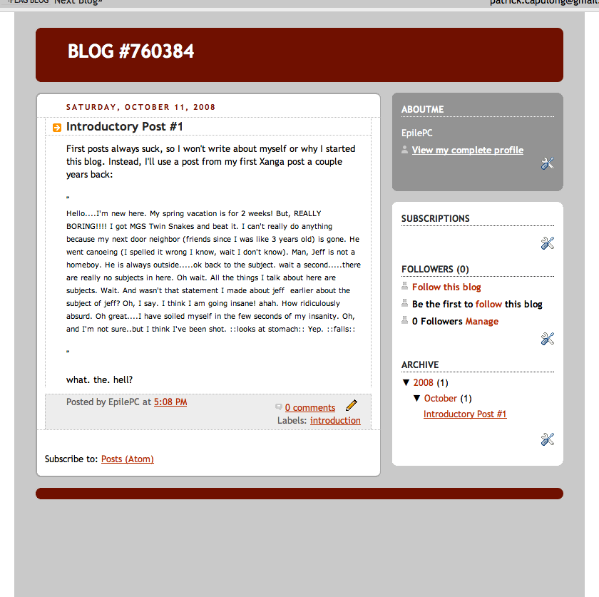
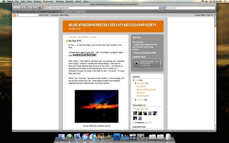
So for the release of epilepc 2.0, I decided to make a snapshot timeline of this blog. Hit the gallery below!
Oh yeah, I just went to Del Amo to watch Transformers 2 in a private theatre rented by camsROBOTICS. So basically, the movie was worse than the annoying freshmen that surrounded me.
Seriously, they deserve to die. One of them kept yelling "PENIS!", another kept getting hard whenever Megan Fox was in frame, and another one brought their family, who would clap AT the movie and SAY THINGS, and by things, I mean ANNOYING THINGS, and my annoying things, I mean "OH YEAH! HE GOT HIM!" and "OH MY GOD AVATAR THE MOVIE?!?!?!?!!? NO WAY NO WAY NO WAY NO WAY NO WAY NO WAY!"
gahboom biggie boom boom biggie eyuhboom failboom hugeboom failgahboom hugetime failboomgahboom boom
Monday, June 22, 2009
Design Proposal #1: Update 11:21 PM
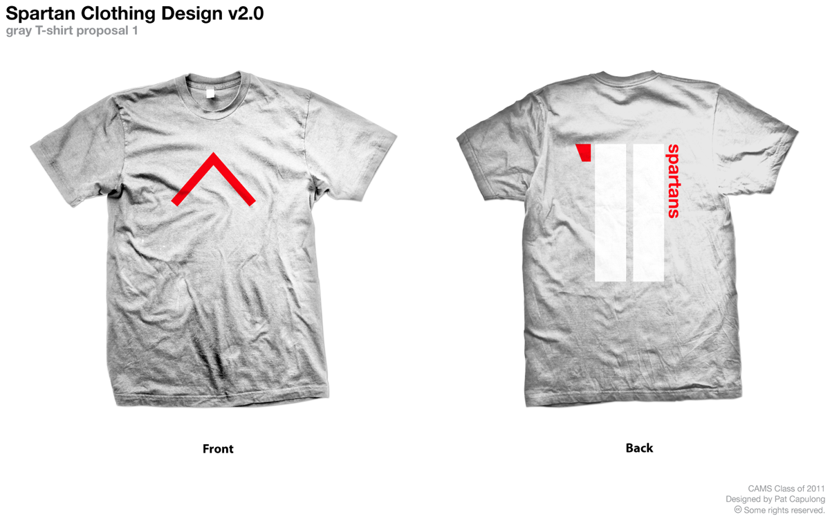
Just got some photo apparel templates, and I'm likin em. I'm getting kinda tired of this design, but it still looks good on a t-shirt. Go ahead and click for a close-up. Forgot about this:

Wednesday, June 17, 2009
About This Blog #6 10:40 PM
I make so many grammatical errors on this blog. It's really embarrassing. Below is a list of some of my errors that make me get hotnervous whenever I think about them:
Seriously, I hate embarrassing failures. When you realize a fail, it will sting only a little bit. Then you'll repress the memory of said fail and get over it. AND THEN, maybe hours, weeks, months, or even years later, you'll remember your fail. And you'll probably remember it on a good day, a random day, during an IDP presentation, or when you're talking to a girl. During this event, you can:end's meatwas awokenvilainized
A. Execute a "facepalm"B. Get hot with embarrassmentC. Say "BOOM!!" (CAUTION: this will make you look insane if said randomly/inappropriately e.g. "Yeah, Pat's really weird. He was sitting next to me in class and he suddenly said 'BOOM' and slammed his forehead on the desk," said Steven. "Yeah, he probably thought of an embarrassing fail. He's so sexy tho," said Dessa.)D. Crumple after getting hit by a wave of embarrassmentE. CryF. Eat embarrassment awayG.Pretend toShoot yourself in the headL. Soil youselfJ. Realize that I just skipped H, I, J, and K, and misspelled "yourself"
But you can avoid this. Just don't make mistakes and don't fail. DEYUGO!
Thursday, June 11, 2009
To-Do List #1: Summer 11:49 AM
- get good at piano
- make better beats
- get good at another instrument, probably guitar
- study for SAT
- study for bio SAT
- complete CAMS Annual Film pre-production packet
- get driver's permit
- get at least 40 service hours done
- hopefully get a wacom, start designing/drawing/illustrating things
sleep forever- write school year end review post
- write sophomore survival guide for freshmen n00bs
Enjoy the break, everyone! We all deserve it.
Sunday, June 7, 2009
Saturday, June 6, 2009
IDP #4 12:55 PM
So the whole sophomore class hates me, and my friend Chris. We get evil stares as we pass by, and shouts of "EVIL!!!" Kasey plans to destroy us.
All we did was ask an ample amount of pertinent and necessary questions that everyone thinks are mean and menacing. I do feel bad for cutting off the respondent's presentation. But please! They answered all the questions well--it helped both sides, petitioner and respondent! Gah. I really hope Kasey doesn't destroy us.
Dream #1 12:46 PM
My brother and I had been living by ourselves for a while. We were having a hard time making ends meat (so dumb...) meet.
We were trying to find a place to park our home, until we found this hardly used parking facility. Unfortunately, it was guarded by an electronic gate lever. So my brother parked right in front of the gate, stepped out, and tried to buck the system while I waited in the back seat. He was just outside the closed driver's seat door, messing with the gate sensors.
There was this black bum, dressed in black, loitering around the parking structure. When he came close to our car the first time, I locked the doors. Then he kept making rounds to the right side of the car and back down the street. I was becoming really apprehensive like I always do when I see bums. But I decided that I should lighten up and consider the possibility that not all bums are dangerous. So I just relaxed in the back seat, waiting for my brother to finish.
Suddenly, I heard rapid stepping. I turned to my right, and I saw a flash of black. I followed it to the front of our car, realizing the danger. "Kuya!" I cried. My brother turned his head with an inquisitive look, when the bum's black arm slammed a knife in his back. I saw the killer's face, crumpled in malice, as my brother slowly collapsed. I was crying. I was asking myself if this was real. Was it real?
Then I woke up. My brother and I were in the same place, but the bum wasn't there. What happened? So I took a nap in the car. Shouldn't have done that. "Done!" my brother said. Yayyy and I woke up again.
I was sweating in my bed, looking for my brother. Duh, he's still in Irvine. Dayum. I've been having these dreams where I keep waking up in the same dream.
Thursday, June 4, 2009
My Day #15 8:34 PM

Anthony. YEH
I got to play with Gene's Intuos 4! Wacom really slimmed it down since that last version. It's crazy thin--0.5 inches, to be exact. Now that I actually saw one and used one I think ima just straight upward buy one. Man, I was able to draw my friend Anthony in five minutes! YEH 4.0

 Posts
Posts


