Monday, July 20, 2009

Corporate Identity Design #1: Beach Cities Orthopedics [UPDATE]

I was afraid that they'd reject my original, so I made another one that more sportsy (Beach Cities Orthopedics and Sports Medicine). I made the helmet and everything myself (big whoop, right? just want to point out that it's not premade stock art).

Saturday, July 18, 2009

Corporate Identity Design #1: Beach Cities Orthopedics

My sister came home from work wearing the new Beach Cities Ortho caps. She hates the logo, which was made by her boss's girlfriend. My sister referred me to design the logo. So this is their current logo (on cap):

Their current logo consists of a barely distinguishable football player silhouette, huge weight BCO (with an ugly C), and an unprofessional typeface below. Problems with this logo:
  • the football player is kinda hard to make out
  • the football player won't scale well (e.g. small logo on stationary)
  • the typeface suggests an unreliable/unprofessional company. neutral and human typefaces are good for corporate identity (helvetica)
  • it's pretty ugly.
  • how do you relate "beach cities" to a football player? I mean they special in sports medicine too... but it just isn't fit for a logo
  • No color. Color scheme strengthens identity (Target, Coke, McDonalds).
So... I set out to resolve these problems and create a scalable, colorful, professional, related, and beautiful logo. I looked at the roundness of the B, C, and O and tried to use it to my advantage. I also tried hard to incorporate something beach themed into the design. Enough about the process—here's my best shot:

See there's uniformity in it. There's a balance in ascender of the B and the wave of the O that acts a descender. Yeah there's a wave, too! On the O. Along with something easily associated with beaches is the beach color scheme—sandy brown and ocean blue!

Illustratorrrr. I made the BCO and wave from scratch, but I used Neutraface again for the type below. I hope you guys like it. Going to propose soon.

Sorry for the writing. isuck and iowanna think at 2am :( sowwy

Monday, July 13, 2009

Teaser #2


Page element. Neck strap. Illustrator.

Sunday, July 12, 2009

Teaser #1


Identity/page element for client. This work is part of a whole new direction for me. Updates later, probably on another site.

Anyway it's a compact flash card, with Stiles' brand as the label. I think it incorporates the logo pretty well: it's something physical, familiar, and associated with photography and cameras.

The logo is still a rough draft. Right now it's set in Neutraface by famous modernist architect Richard Neutra, but the whole thing isn't anything special. gotta put character. UPDATE: added the leaf! he's a nature guy.

Oh yeah this was created in Illustrator. Here's the old one.

Monday, June 29, 2009

I hate my blog.

Wednesday, June 24, 2009

About This Blog #7: epilepc 2.0!

Well, I've been working on this site for about two full days now. Excuse my writing for this post (I know that's a terrible thing to say on a blog), I just had my brain asplode from working for two days (repetitive).

Anyway, this revamp took me a while because Blogger isn't that customizable. So, I had to find a bunch of hacks to make static pages and a Lightbox. It was all tedious. APPRECIATE PLZ

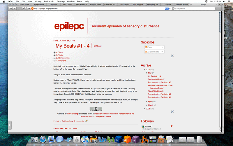
As you can see, there's a shiny new menu resting at the top-right of the page. That's where most of the revamp occurred. Please, check them out!

So for the release of epilepc 2.0, I decided to make a snapshot timeline of this blog. Hit the gallery below!

Photobucket Photobucket Photobucket Photobucket

Oh yeah, I just went to Del Amo to watch Transformers 2 in a private theatre rented by camsROBOTICS. So basically, the movie was worse than the annoying freshmen that surrounded me.

Seriously, they deserve to die. One of them kept yelling "PENIS!", another kept getting hard whenever Megan Fox was in frame, and another one brought their family, who would clap AT the movie and SAY THINGS, and by things, I mean ANNOYING THINGS, and my annoying things, I mean "OH YEAH! HE GOT HIM!" and "OH MY GOD AVATAR THE MOVIE?!?!?!?!!? NO WAY NO WAY NO WAY NO WAY NO WAY NO WAY!"

gahboom biggie boom boom biggie eyuhboom failboom hugeboom failgahboom hugetime failboomgahboom boom

Monday, June 22, 2009

Design Proposal #1: Update

Just got some photo apparel templates, and I'm likin em. I'm getting kinda tired of this design, but it still looks good on a t-shirt. Go ahead and click for a close-up. Forgot about this:

Creative Commons License
CAMS Class of 2011 Spartan Clothing Design v2.0 by Pat Capulong is licensed under a Creative Commons Attribution-Noncommercial-No Derivative Works 3.0 United States License.