My sister came home from work wearing the new Beach Cities Ortho caps. She hates the logo, which was made by her boss's girlfriend. My sister referred me to design the logo. So this is their current logo (on cap):
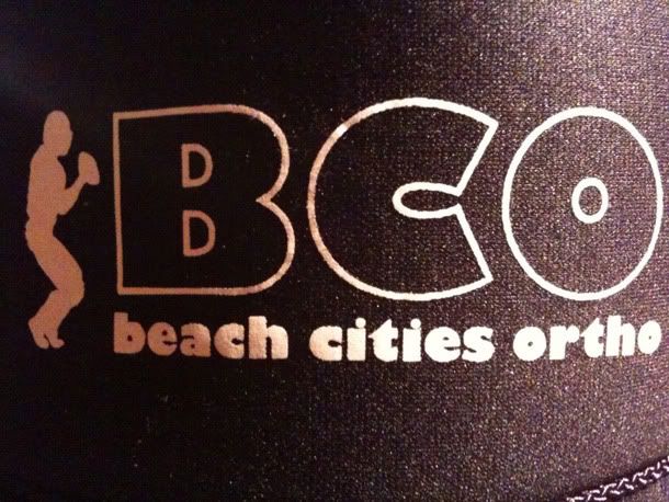
Their current logo consists of a barely distinguishable football player silhouette, huge weight BCO (with an ugly C), and an unprofessional typeface below. Problems with this logo:
- the football player is kinda hard to make out
- the football player won't scale well (e.g. small logo on stationary)
- the typeface suggests an unreliable/unprofessional company. neutral and human typefaces are good for corporate identity (helvetica)
- it's pretty ugly.
- how do you relate "beach cities" to a football player? I mean they special in sports medicine too... but it just isn't fit for a logo
- No color. Color scheme strengthens identity (Target, Coke, McDonalds).
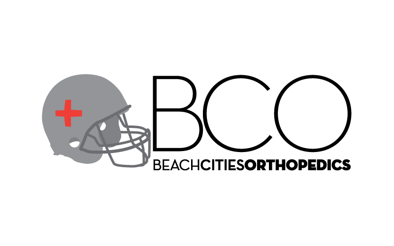
So... I set out to resolve these problems and create a scalable, colorful, professional, related, and beautiful logo. I looked at the roundness of the B, C, and O and tried to use it to my advantage. I also tried hard to incorporate something beach themed into the design. Enough about the process—here's my best shot:
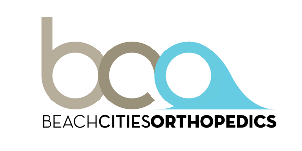
See there's uniformity in it. There's a balance in ascender of the B and the wave of the O that acts a descender. Yeah there's a wave, too! On the O. Along with something easily associated with beaches is the beach color scheme—sandy brown and ocean blue!
Illustratorrrr. I made the BCO and wave from scratch, but I used Neutraface again for the type below. I hope you guys like it. Going to propose soon.
Sorry for the writing. isuck and iowanna think at 2am :( sowwy