Saturday, August 1, 2009

Web Design #2

Client wanted a very minimalist layout without images. That meant the design had to be 100% typography.

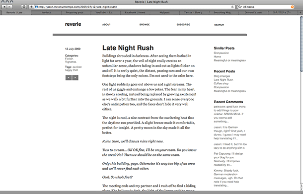
So to layout everything I used a 16 column grid. Grids are very helpful and used by a lot of big name designers (Wim Crowell, Josef Muller-Brockmann). I didn't use rows though, so flow of text is uneven vertically sometimes, fail :\. But other than that you'll see that everything is aligned.

Umm I used big type, especially in the main article for the sake of readability. Web designers like to use super small fonts because they think cluttered is good or because they're following the trend that was set when screens were super small. I also used #333 instead of black, so that it's easier on the eyes when reading on the white background. APPRECIATE.

The markup is not w3 valid(sorry, Jason!). It still works... but the layout falls apart in IE6. I'll probably rewrite it and release it as a free wordpress theme. Which reminds me, I wanna make tumblr themes. Here's the link:

Print Design #1! Meet the Spartans

mmkay, I made a lot of flyers because I wanted to. these are still drafts—the room numbers are still 0000. does anyone know brown, nishiyama, and paus's room numbers?thankX.

It's set in helvetica... I like Helvetica. I don't care about the typeface being used everywhere (watch Helvetica, a documentary by Gary Hustwit), and I agree with Massimo Vignelli (pretentious reference to designer) that type should not be expressive... to a certain extent. There are situations that are perfect for certain typefaces or vice versa. Type can be expressive in a design, if it's done really well.

And I really don't like it when people think that typography is picking a font. This leads to grunge fonts on a picture of smiling children. I think charisse or demitri did this. not attacking you guys, don't worry.

So I picked Helvetica, a really neutral typeface. I didn't use a serif font because... iono I want to have a modern image for our class? sure spartans are ancient... but we're kids and it's 2009, so modernism ftw.

So yeah, I designed these to hopefully catch the eye. These will be printed on letter size paper, so they're pretty small. Big designs in the middle attract attention, and then the event info gets noticed. I made all of the graphics in illustrator.

/incoherent