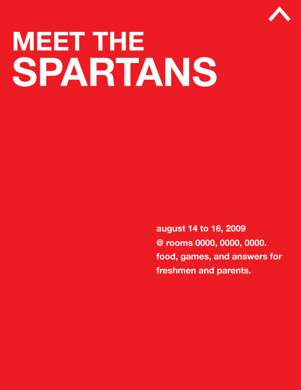
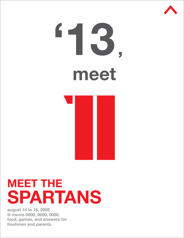
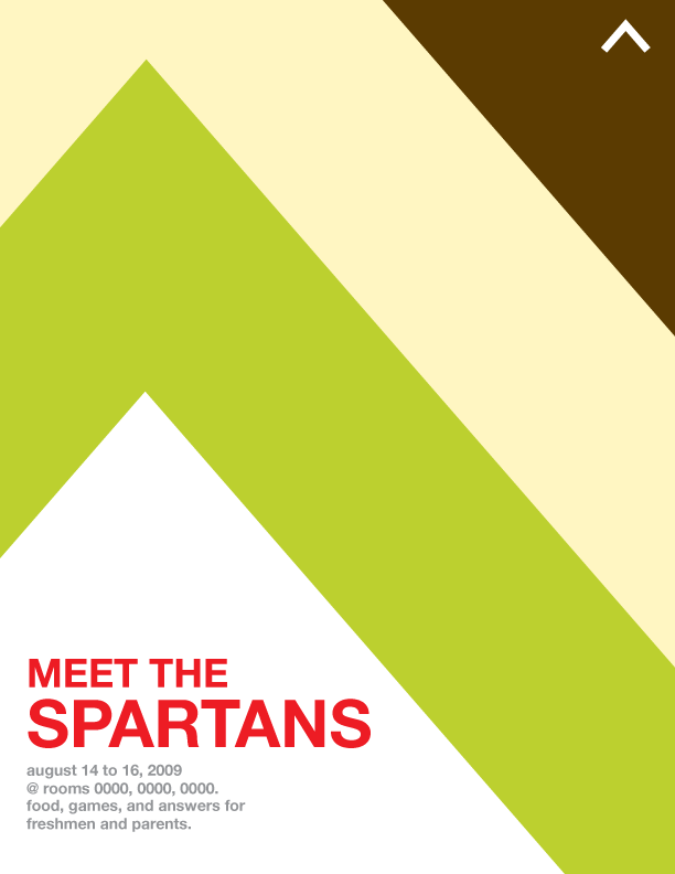
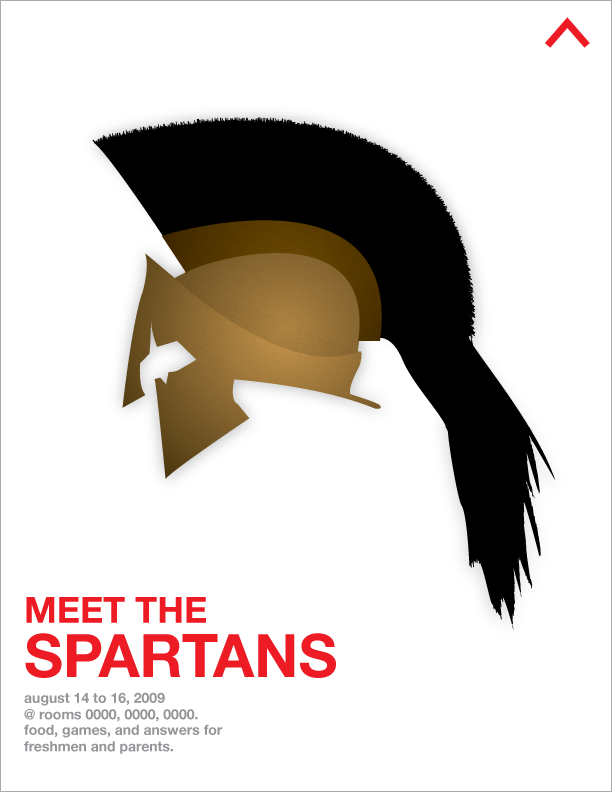
mmkay, I made a lot of flyers because I wanted to. these are still drafts—the room numbers are still 0000. does anyone know brown, nishiyama, and paus's room numbers?thankX.
It's set in helvetica... I like Helvetica. I don't care about the typeface being used everywhere (watch Helvetica, a documentary by Gary Hustwit), and I agree with Massimo Vignelli (pretentious reference to designer) that type should not be expressive... to a certain extent. There are situations that are perfect for certain typefaces or vice versa. Type can be expressive in a design, if it's done really well.
And I really don't like it when people think that typography is picking a font. This leads to grunge fonts on a picture of smiling children. I think charisse or demitri did this. not attacking you guys, don't worry.
So I picked Helvetica, a really neutral typeface. I didn't use a serif font because... iono I want to have a modern image for our class? sure spartans are ancient... but we're kids and it's 2009, so modernism ftw.
So yeah, I designed these to hopefully catch the eye. These will be printed on letter size paper, so they're pretty small. Big designs in the middle attract attention, and then the event info gets noticed. I made all of the graphics in illustrator.
/incoherent


8 comments:
Thank you for posting them.
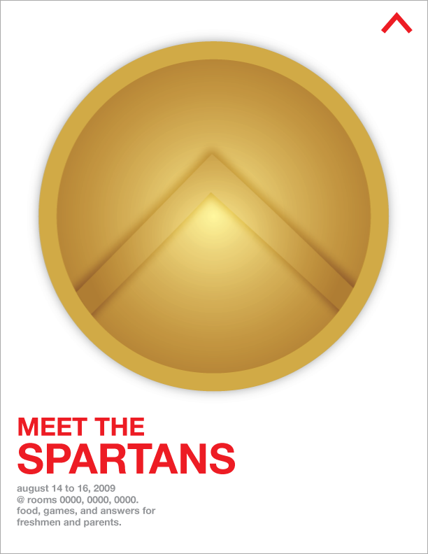
I like all of them (except maybe the shield) and love image 3, 4, 6, 7, and 6.
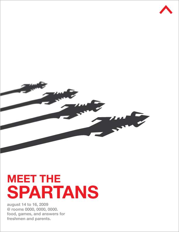
The last two must have taken a long time. I didn't even know Illustrator could do all this. I feel like I have magic in my laptop.
P.S. blurred (or whatever word it says on Illustrator)weapons = smart
LOL. and just as an afterthought.
When I was looking at your flyers, I thought,"Now the Spartans need to live up to the flyers and not come off as uncool, boring upperclassmen."
heh, thank youu. I'm glad you like (most of) them. I hope your expectations weren't high, and I hope that you weren't extremely disappointed. kek
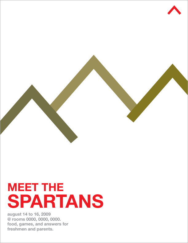
P.S. Did you see the mountains in number 6? I love my lambdas.
Yes, I did see your mountains. :]
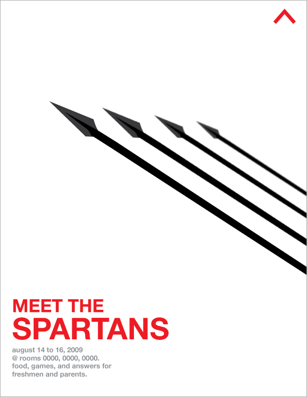
I can't stop sneaking a peak at flyer #7. I keep imagining a row of Spartans on the left of the flyer, holding their weapons vertical and the sun casting a shadow of the weapon heads on the flyer itself.
Did you make it to seem that way or is it just my imagination running wild?
oh that's a cool interpretation. I just made silhouettes of those weapons and lined them up in a perspective where soldiers are lined up. I was going to color them in, but then I'd have to redo the sketch to have depth. so yeah shadow concept is cool.
but they're persian arrows :O don't tell
:o These are really cool~
Awesome.. your designing skills will really come in handy for us. on behalf of the board.. thanks a lot, we've been meaning to get more sophisticated posters and stuff up for awhile
Also, i like your designing intuition. Here is proof that simplicity can indeed be a beautiful thing.
Post a Comment