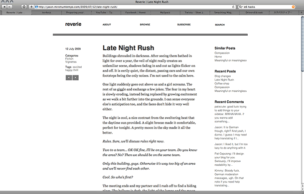
 Client wanted a very minimalist layout without images. That meant the design had to be 100% typography.
So to layout everything I used a 16 column grid. Grids are very helpful and used by a lot of big name designers (Wim Crowell, Josef Muller-Brockmann). I didn't use rows though, so flow of text is uneven vertically sometimes, fail :\. But other than that you'll see that everything is aligned.
Umm I used big type, especially in the main article for the sake of readability. Web designers like to use super small fonts because they think cluttered is good or because they're following the trend that was set when screens were super small. I also used #333 instead of black, so that it's easier on the eyes when reading on the white background. APPRECIATE.
The markup is not w3 valid(sorry, Jason!). It still works... but the layout falls apart in IE6. I'll probably rewrite it and release it as a free wordpress theme. Which reminds me, I wanna make tumblr themes. Here's the link:


1 comments:
the epitome of simplicity -- nice work
Post a Comment